









Trivia: why we built this
The same HTML you write has to survive a 14× width range — from 280px (a Galaxy Fold, closed) to 3840px (a 4K display). That's one codebase, one set of CSS, stretched across screens so different they barely belong in the same category.
Stranger still: "mobile" didn't only get bigger. The Fold's cover screen at 280px is narrower than the original iPhone's 320px. The smallest screen you must support today is smaller than the one that started the whole responsive era.
Chrome DevTools shows you one of those widths at a time. So checking five breakpoints means looking at five pictures minutes apart and comparing them from memory — and memory is exactly where layout bugs hide. You don't notice the 20px that shifted; you notice it when a client does.
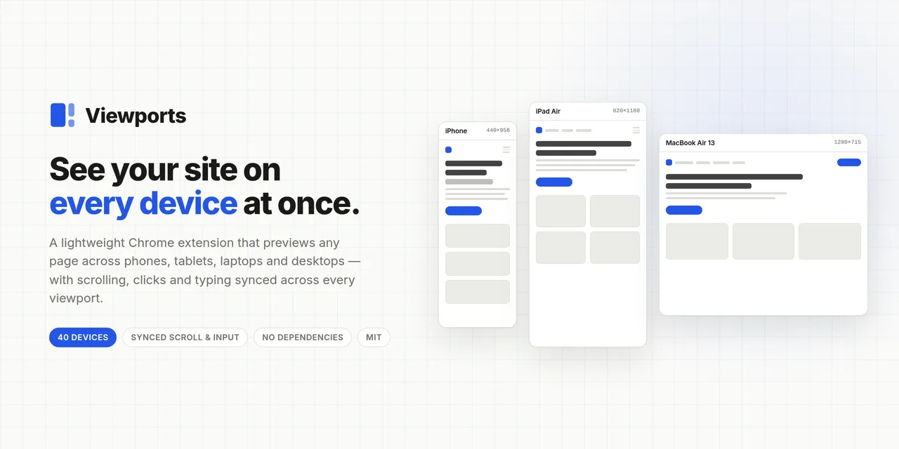
So we put them side by side. One tab, every width, scrolling and clicking in sync.
Bonus: four viewports in one tab used ~35% less RAM than the same site in four tabs — the iframes share one renderer.